Highlight the few words
Green sits behind “doers” and “status quo”, and later behind “can” and “customer”. The rest of the type stays black.
Websites
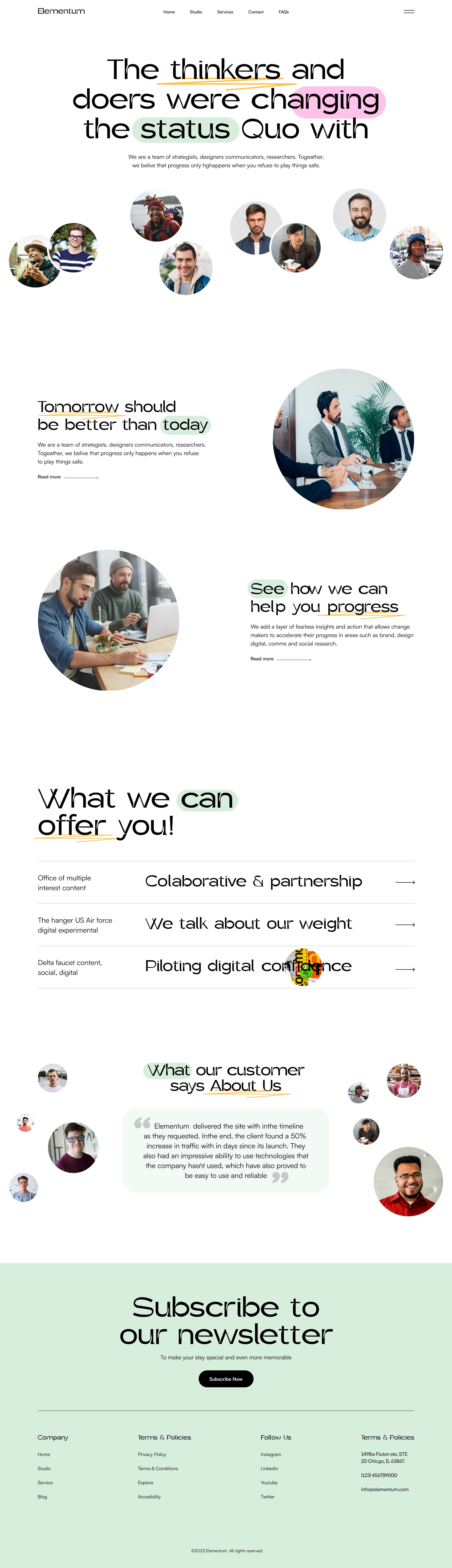
Elementum wanted a website that felt like the studio: direct, human, and a little unexpected. The page is mostly type and faces, with green used only where a word or a block needs weight.
Design system
White space does most of the work. Moss green highlights words in the headline, fills the newsletter, and marks the current idea. Portraits are always circles, so people are the repeating shape.
Green sits behind “doers” and “status quo”, and later behind “can” and “customer”. The rest of the type stays black.
Every portrait uses the same circular crop. Groups of faces ring the headline and the quote so the studio is present throughout.
What the studio offers is a short list with arrows. It reads faster than a wall of equal boxes.
The newsletter is the only full green section. It closes the page the way the highlights opened it.
What changed
The same story, told with a clearer system so the page does more of the explaining.
01
The headline takes a position. Faces around it show who holds that position, before any service is named.
02
“Tomorrow should be better than today” and a progress note sit with large circles, so the middle of the page stays editorial.
03
Four lines replace a services grid. Each line is a conversation the studio is ready to have.
04
The client line sits in the same circle system as the studio, so the testimonial belongs to the design instead of a separate widget.
Client
“Clients tell us the site feels like a first meeting. They already know how we think, and the first call is about the work, not an introduction.”