Orange as emphasis
Orange blocks carry the mission statement and the words we want remembered. Body copy stays quiet on the peach field.
Websites
The Banik had a mission people cared about and an about page that read like a document. The new page leads with the story, then proves it with faces and numbers.
Design system
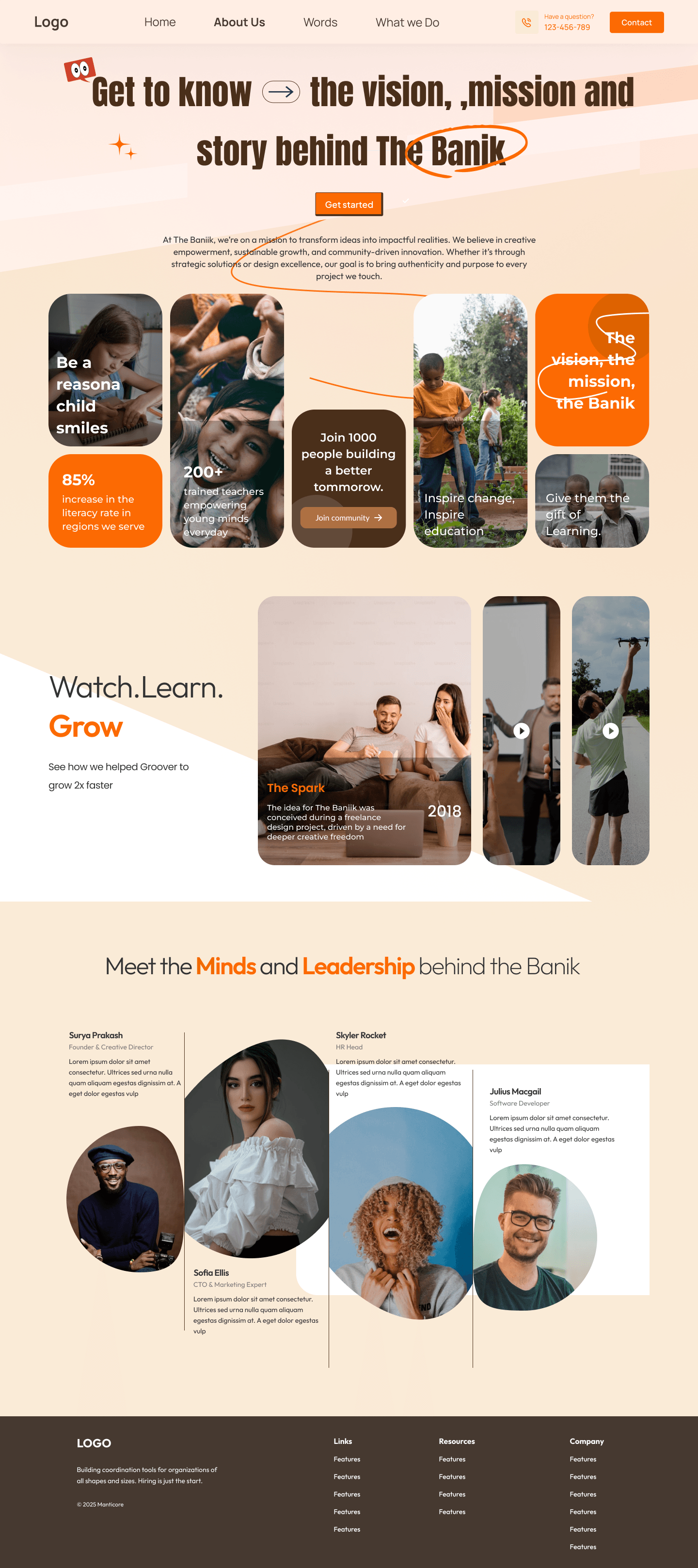
Peach is the ground, orange is the voice, and marker underlines pick out the words that matter. Photos sit in mixed rounded frames so the page feels assembled by hand, not dropped into a template.
Orange blocks carry the mission statement and the words we want remembered. Body copy stays quiet on the peach field.
Portraits, stat tiles, and short lines share one band. No single hero photo has to carry the whole organization.
85% and 200+ sit beside the communities they describe, so impact is never a floating statistic.
Portraits use different frames on purpose. The variety keeps a team of four from looking like a staff directory.
What changed
The same story, told with a clearer system so the page does more of the explaining.
01
The headline names vision, mission, and story, with a hand-drawn circle on the words that define the organization.
02
Impact stats and a short invitation to join sit inside the opening collage, not on a later page.
03
A media row gives the work a second way in: film stills with play marks, dated and titled, instead of another paragraph.
04
Leadership portraits finish the story. Visitors meet who is accountable before they reach the footer.
Client
“Visitors used to leave our about page without knowing who we are. Now they see the mission, the numbers, and the people in one pass, and they write to us ready to help.”