One action color
Yellow is reserved for Register and the primary steps. Everything else stays cream, ink, or a category tint.
Websites
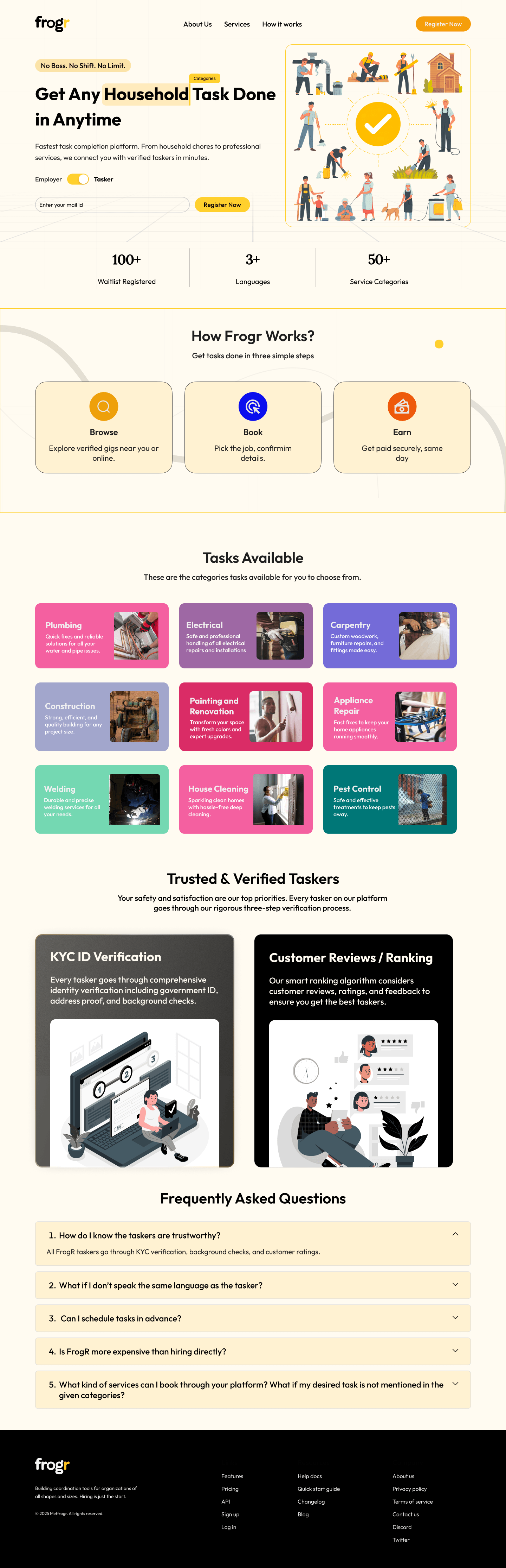
Frogr needed a website that explains a busy marketplace in one glance: people looking for help, taskers ready to work, and a path from browse to booking.
Design system
The system is built on a warm paper background, one sunflower yellow for action, and soft illustrations so the service feels neighbourly rather than corporate. Task types each get their own color so a long list stays easy to scan.
Yellow is reserved for Register and the primary steps. Everything else stays cream, ink, or a category tint.
Small scenes of home tasks sit beside the headline so visitors understand the offer before they read a paragraph.
Plumbing, electrical, carpentry, cleaning, and the rest each live in a distinct tile. Color does the sorting; the label does the naming.
KYC verification and customer reviews sit as a pair, so proof shows up before the FAQ.
What changed
The same story, told with a clearer system so the page does more of the explaining.
01
Browse, Task, and Earn replace a long explanation of how the marketplace works. Each step is a card with one job.
02
The category grid covers the real work people book, from plumbing and painting to pool care, instead of a generic services menu.
03
Register sits with the headline, and a short line tells visitors they can connect with verified taskers in minutes.
04
The FAQ comes after verification and reviews, so the page answers doubts only once trust is already on screen.
Client
“The new site finally looks like the product we run. People understand the tasks, see that taskers are verified, and register without a walkthrough from our team.”