Two colors, used fully
Brown holds the story and the footer. Orange holds the work: capabilities, leadership, and the contact close.
Websites
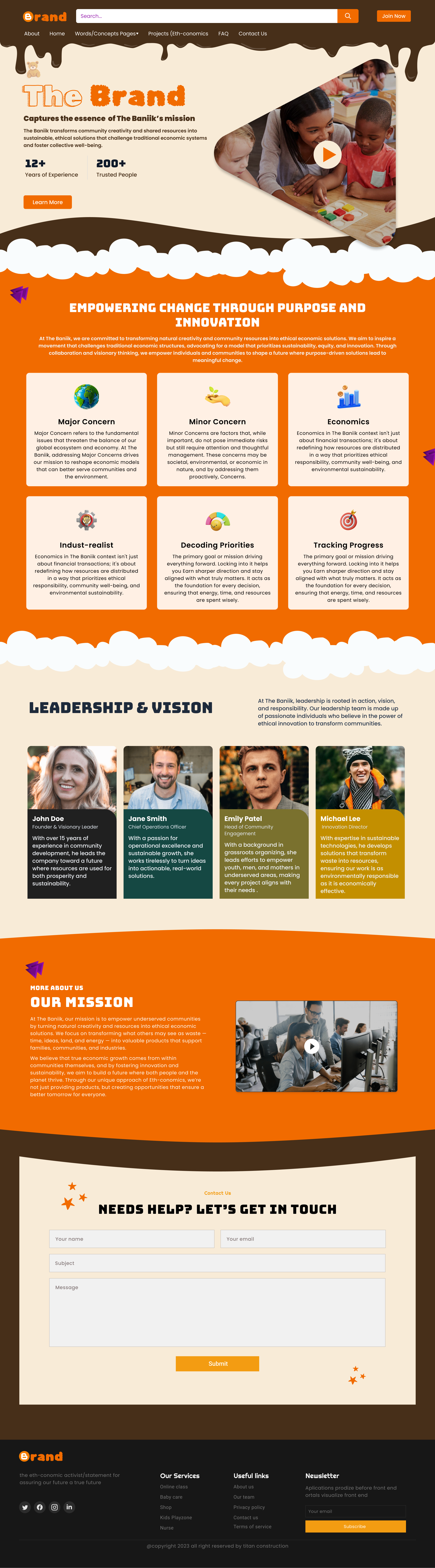
The Brand needed a site that felt like the company: warm, a little playful, and serious about the work. The page carries one palette from the drip in the header to the form at the end.
Design system
Cocoa brown and tangerine orange split the page into clear bands. A chocolate drip marks the top, cloud shapes separate sections, and every card shares the same radius and icon style.
Brown holds the story and the footer. Orange holds the work: capabilities, leadership, and the contact close.
The drip, the clouds, and the small spark marks show up more than once so the page feels like one system.
Six cards share one size. Icons and a single line of detail keep major concern, cause, and progress easy to compare.
Portraits sit on solid panels instead of a white grid, so the team belongs to the brand rather than floating above it.
What changed
The same story, told with a clearer system so the page does more of the explaining.
01
The opening still has a play control, so the brand story can be watched before it is read.
02
The capability grid comes immediately after the promise, with six named areas instead of a vague what-we-do paragraph.
03
Copy and a second film sit side by side, so the mission is both said and shown.
04
The form uses the cocoa band and the same orange button as the hero, instead of a generic contact block.
Client
“We finally have a website that looks like our brand in the room. Partners mention the color and the clarity, and the contact form actually gets finished.”