Light as a path
The green wave under the headline is the brand signal. It returns in small glows so the page never needs a second accent.
Websites
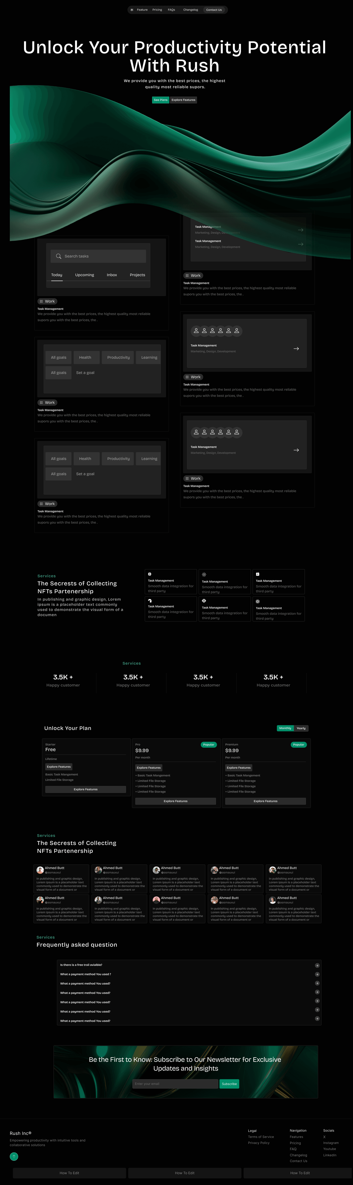
Rush is a productivity product that was being explained on a light, generic page. The new site puts the interface in a dark field and lets one green light lead the eye.
Design system
The canvas is near black. Emerald is the only bright color: it draws the hero wave, the plan highlight, and the newsletter button. Product UI sits in dark glass cards with quiet borders.
The green wave under the headline is the brand signal. It returns in small glows so the page never needs a second accent.
Screens of the product live in inset panels. Visitors see the tool, not a mockup floating on white.
Headlines are large and light. Body copy is small and gray so the interface shots remain the loudest thing.
Pricing uses the same dark cards. One plan is marked so the choice is visible without a brighter page.
What changed
The same story, told with a clearer system so the page does more of the explaining.
01
Dashboard cards appear as soon as the headline ends, so the promise is backed by the actual interface.
02
The emerald ribbon replaces a generic hero image and ties the top of the page to the close.
03
Pricing arrives once the product has been shown, with three choices in one row.
04
The FAQ handles objections. The newsletter is a single line at the end, in the same green as the hero.
Client
“The dark site made Rush feel like a product people want open on their desk. Demos start further along because visitors have already seen the interface.”