Air around the product
Screenshots never touch the edge of a section. The blue field gives them room so a dense CRM still feels calm.
Websites
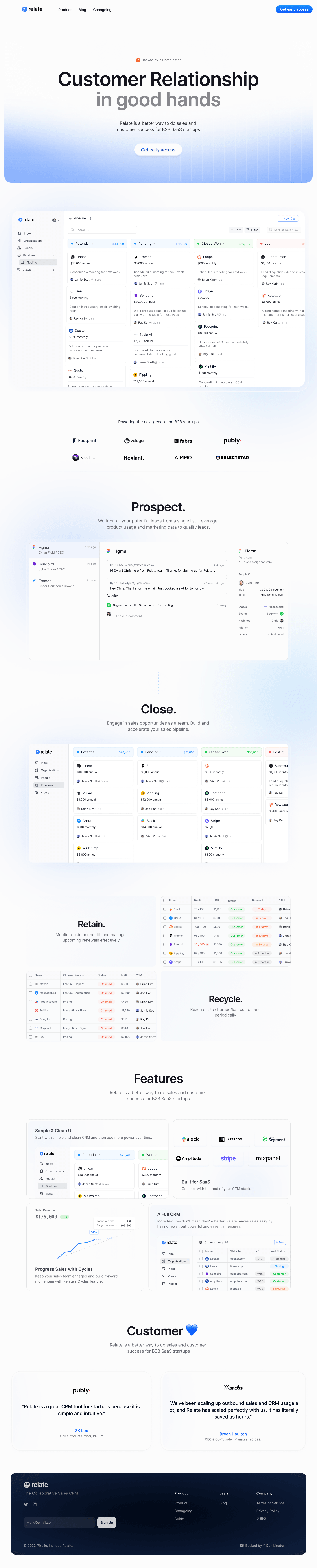
Relate had a capable CRM and a homepage that listed features. The new page walks through the pipeline the way a team actually works.
Design system
A pale blue wash holds the page. Product screens sit in white frames with soft shadows so the UI stays readable. Blue is the link and the button; the product itself supplies the other colors.
Screenshots never touch the edge of a section. The blue field gives them room so a dense CRM still feels calm.
Prospect, Close, Retain, and Recycle are the chapters. Each one shows the screen that belongs to that moment.
Every product view uses the same frame, radius, and shadow. The system is the frame; the product is what changes inside it.
The customer section and footer stay in the same blue family, with a small heart as the only playful mark.
What changed
The same story, told with a clearer system so the page does more of the explaining.
01
“Customer relationship in good hands” replaces a product-name hero. Two actions sit under it: start a trial, or watch it.
02
Four stages replace a grid of twenty features. Each stage has one screen and a short line about what the team does there.
03
Track, pipeline, and related tools appear only once the visitor has seen the flow.
04
The close is a short customer note, not a wall of logos competing with the product.
Client
“Sales calls used to start with a tour of the product. Now people arrive having already followed prospect, close, retain, and recycle on the site.”